Building an accessible ebook
Since their widespread emergence in the early 2000s, ebooks have attracted considerable attention — and even some controversy.
While some readers have mourned the so-called ‘death of the book’ and a loss of the print book’s more tactile qualities, many others have welcomed the portability and improved accessibility that ebooks can offer.
For readers with a disability — such as visual impairments, reading difficulties like dyslexia, and motor skill problems — ebooks represent a more viable format by which to access stories, information and reading experiences that have otherwise hovered beyond reach.

As the BNGO Books team has observed, ebook formats allow us to make one book for all users: ‘Instead of having the print edition and the braille edition and the large print edition and the audiobook, we can include everyone in our audience with one format.’
Not many ebooks are fully accessible, however.
As the market has grown and diversified, the wide variety of available ebook related technologies means that competing platforms and devices incorporate varying levels of accessibility and different methods of access. Over the last couple of years in particular, the publishing industry has recognized a growing need to improve accessibility for all readers, especially as self-publishing continues to gain momentum and increasingly more apps and e-reading platforms proliferate.
What makes an ebook accessible?
When an individual reads a book, article, or other document, they derive meaning from more than just the words alone. Stylistic cues such as the size and weight of a font provide additional information about how to read the text.
For example, chapter titles in a novel are often formatted differently from surrounding text — usually in larger font or a different typeface altogether. Hundreds of years of book design evolution have led to well-established rules about these visual cues — not only how they work best but also how they can be aesthetically pleasing. While many readers may not be conscious of these visual cues, they do important work. A visually impaired reader will typically need extra information to let them know where they are up to in a document and to make clear what type of text they’ve encountered or are interpreting.
But let’s step back for a moment.
In 1997, the World Wide Web Consortium (W3C) developed the Web Accessibility Initiative (WAI) with its Web Content Accessibility Guidelines (WCAG) and tutorials to help enable people with disabilities to participate equally on the Web. In addition, the Digital Accessible Information System (DAISY) Consortium is an initiative bringing accessibility to all sorts of digital content (interestingly, it was the DAISY Consortium who first published an accessible ebook in 1994).
The International Digital Publishing Forum (IDPF), the folks who define the EPUB ebook standard, merged with the W3C in 2017 and have adopted these web recommendations for publishing. To ensure a degree of quality of the accessible information in ebooks, the DAISY Consortium maintains Ace, the Accessibility Checker for EPUB, a tool that checks the soundness (but not completeness) of existing accessibility information in an ebook. It also helps that the Canadian National Network for Equitable Library Service (NNELS) has collected a great summary of these publishing recommendations.
So, accessible ebooks, like accessible web content, usually include additional semantic markup to assist with navigation and to identify the purpose and meaning of content for impaired readers. This kind of semantic information is encoded into content using dedicated HTML markup tags (e.g. ‘h1’ for chapter titles), but also by attributes to markup tags. Accessibility information may also include textual image descriptions and audio transcripts to meet a range of readers with various needs.
Unfortunately, manually improving the accessibility of an ebook or other digital content to ensure that it complies with these standards can be time-consuming and tedious manual labor, and thus expensive.
Given the right tools, however, individuals or publishers interested in building accessible ebooks no longer need extensive technical knowledge about how accessibility is implemented for ebooks, nor do they require specialist skills or loads of free time.
Intelligent software such as Bookalope can step in to streamline and simplify the process of building accessible ebooks efficiently and reliably.
Building accessible ebooks with Bookalope
Because semantic structure provides much of the foundation for building accessible documents, Bookalope has an AI-assisted workflow whose first step is to ‘understand’ the styles and structure of a given document and how they work to organize content and facilitate meaning. In simpler terms, Bookalope attempts to extract from the visual design of a document (large bold text with ample white space surrounding text) the actual intended semantic elements (chapter title).
Let’s look at an example.
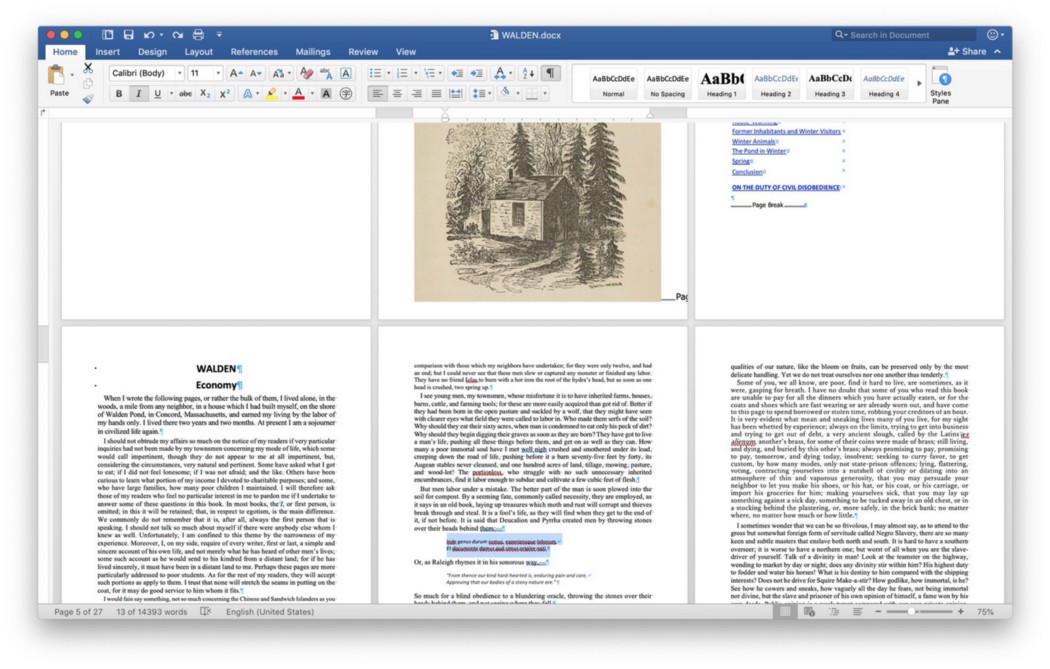
Here we have the Word file of a book which is somewhat inconsistently styled — you have to look closely to see the subtle changes in font, size, or weight that are scattered throughout — but nonetheless is complete as far as its content goes.
When we upload this file to Bookalope, the magic begins immediately!
Bookalope extracts all of the textual content from the file, as well as images, tables, and as much of the visual styling information as it needs for the AI to meaningfully classify the content’s semantic structure.
It then cleans up the extracted information to get rid of the cruft that often sneaks into Word files, such as editing history, cut-and-paste residue formatting, and Word’s own internal document organization.
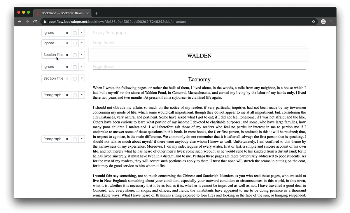
After that, Bookalope runs its AI to classify the content’s structure based on the visual styling of the individual text elements and their context. It then presents the result of that classification for review.
It’s worth mentioning that Bookalope’s classification AI is not perfect, like any other machine classification or image-recognition software. Even as humans, we sometimes struggle to understand the intended structure of a poorly formatted manuscript! However, an AI-assisted structure classification tool like Bookalope gets us a long way towards smooth (and largely automatic) book conversion.
Having a semantically structured document ensures that correct and detailed accessibility information can be generated automatically for the ebook!
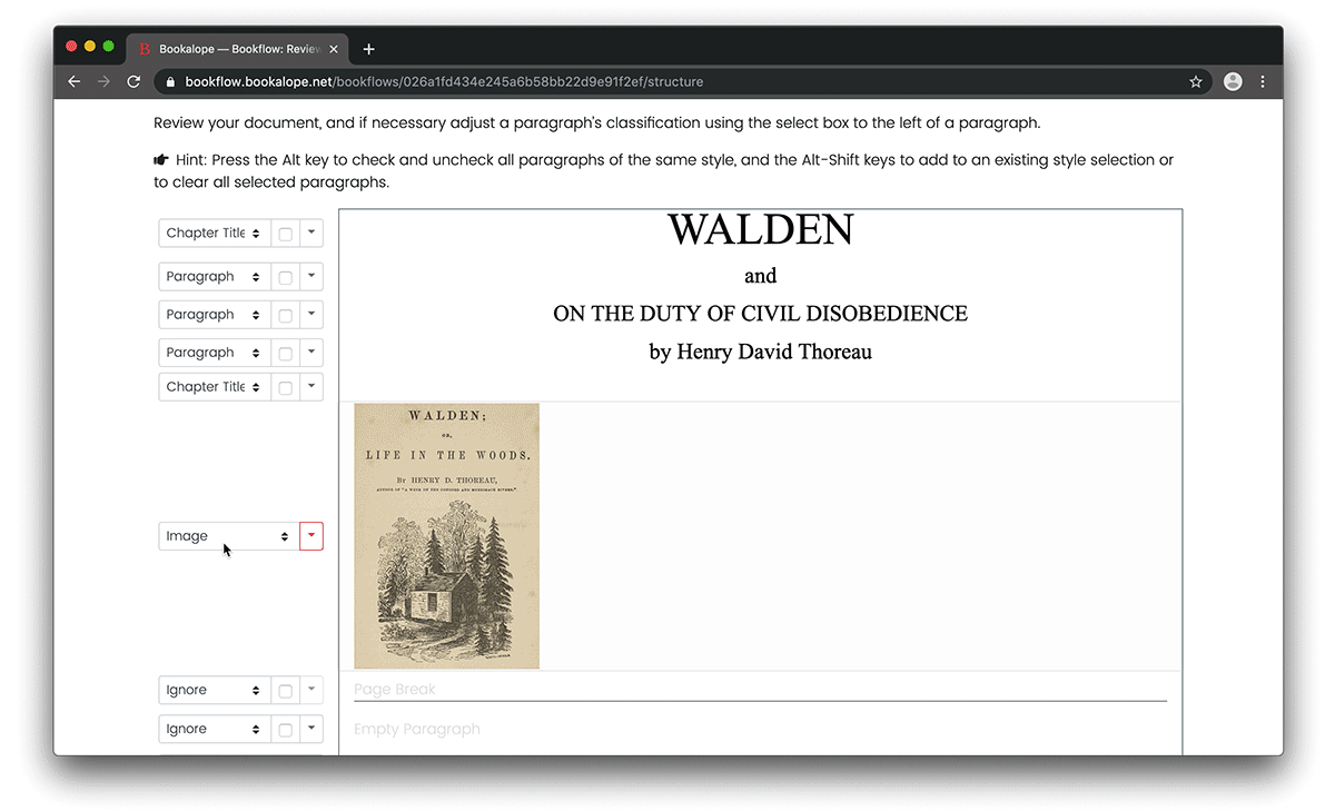
Where Bookalope’s classification doesn’t quite nail it, we can use the website to tweak the coarser structure of the document. We can also add more semantic information — for example, we might add more specific meaning to particular chapter titles (this chapter title is only for the introductory chapter or the table of contents) or paragraphs (this paragraph is actually a side narrative).
Likewise, for images, we can easily add descriptions that will help impaired readers understand what’s happening in a photograph, illustration, or figure.
Once we’ve confirmed the structure of the document, the hard work is behind us. Next, Bookalope shows us various content and typographical issues that we may choose to fix or ignore, such as different regional spellings, punctuation inconsistencies, and other small typographical and stylistic details.
And, just like that, we’re done!
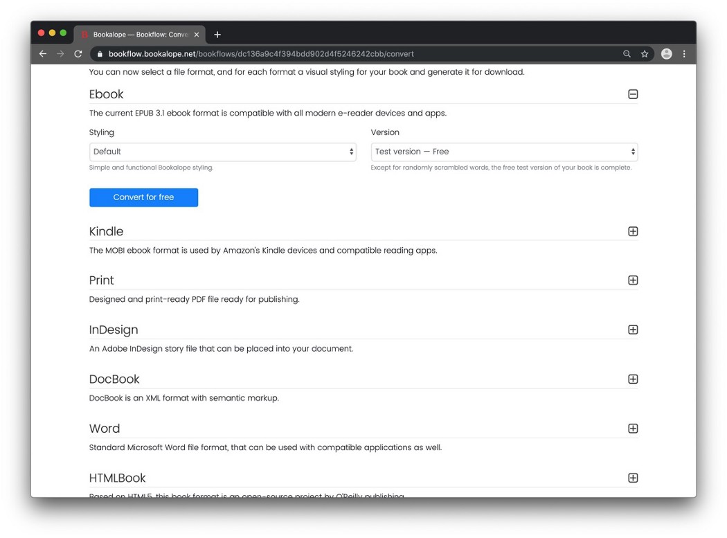
In only a handful of steps, we now have the choice to download our book in different formats. For the purpose of this post, the accessible EPUB 3 format is the most relevant and interesting. To export the file as an ebook in EPUB format, select a visual style from the drop-down list, and then convert and download the book.
Bookalope will assemble the ebook, and run the EPUB validator and Ace tools mentioned above to ensure that the accessibility information has been correctly applied and the ebook validates according to the strictest industry standard.
And there you are… a few clicks from a crummy Word document to a clean and accessible ebook.
Easy peasy.