Of Carts and Horses
The way we share written stories changed with the advent of computers.
For much of human history, a written story was — sometimes quite literally — set in stone. In medieval Europe, scribes turned writing into an art. And since the invention of movable type in the fifteenth century (I recommend reading Alix Christie’s novel Gutenberg’s Apprentice), we have evolved the art of book design and typography into a perfected craft: typefaces, illustrations, inks, paper, binding. We manufacture books, and we make them everyday items to behold, amuse, entertain, and educate. (Amaranth Borsuk’s The Book offers a modernist overview.)
Books can be beautiful if they are written, designed, and printed by talented artists. Richard Hendel’s insightful books, On Book Design and Aspects of Contemporary Book Design, illustrate how artists and skilled professionals create beautiful printed books. But printed books are static in their beauty, and their design is often constrained by budget and process. Within these constraints, the designer composes the page of typefaces, text, and illustrations, and the space in between. The publishing industry has developed and streamlined this process over centuries to accommodate the printed medium.
Computers, however, are a different beast altogether: the design of books for digital presentation must be reconsidered from the ground up.
The traditional, static print book design is being enriched by willful, interactive, connected, and dynamic user customization.
The traditional, static print book design is being enriched by willful, interactive, connected, and dynamic user customization. The reader herself takes over design aspects of the written story in that she is free to choose the dimension of her proverbial page (a wide landscape monitor or a narrow phone screen) as well as the typeface, its size, line width and spacing, margins, and so forth. In contrast to print books, the design of electronic books must adapt to the reader’s choices instead of dictating them.
Such freedom stirs a colorful mess, and I love it.
Over the past decade, though, traditional publishing has embraced this new freedom slowly, if at all. Today’s publishers seem to perceive ebooks as an afterthought, as a continuation of the printed book. It’s a bit like putting the cart before the horse: the book is being digitally designed for print, and then that static print — with all of its set-in-stone constraints — is being forced in one way or another into a digital ebook again.

The traditional process to build books does not embrace and integrate ebooks, it merely adds them as a byproduct. But that makes the process expensive and cumbersome, and it too often delivers ebooks that are invalid, ill-designed, and render poorly for the reader.
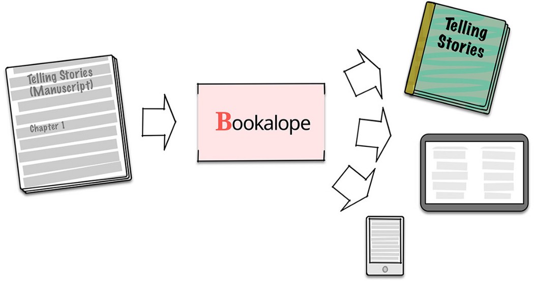
Building books with Bookalope is different.
It is time to embrace the freedom that electronic devices and digital ebooks offer, instead of confining contemporary book design by a process that has hardened over decades and centuries. It is time to make the digital incarnation of a book a first-class citizen equal to the printed book, not its addendum.
We have to rethink the process of book design for multiple media; we must design multiple versions of our books simultaneously and equal to one another. This will work well for some books and less so for others, because some content wants to be presented with wide and sweeping images that cannot be confined to the small screen of a handheld device. And while the reader chooses the media and its settings for her book, the book designer ought to enable a beautiful book no matter what the reader’s choices are.
So how does Bookalope help?

When working through a manuscript, Bookalope strictly separates the book’s content and semantic structure from the visual design and presentation of that content. Therefore, the first step is to organize the semantic structure of the book as the author intended it with the assistance of a custom-built AI-assisted classifier. While this first step can not be automated perfectly, Bookalope takes most pain out of structuring a raw manuscript and shortens it to just a few minutes.
Next, Bookalope dives into that structured content and cleans it up, it flags punctuation issues, it fixes typographical and structural hiccups, and it marks up spelling problems and other linguistic irregularities.
Finally, similar to the traditional publishing process, the book needs to be designed based on the story and on the publisher’s constraints. Bookalope provides various design templates that can be applied to the book content, each tailored specifically for print book and ebook. Once built, the book is a finished product rather than being a stepping stone for yet another medium. By working from one single and semantically structured source, Bookalope provides an efficient and consistent process that is without cumbersome steps that mush together the book’s structure, content, and design for different media.
When I read Richard Hendel’s essay “The Conundrum of the E-Book” (in the aforementioned Aspects of Contemporary Book Design), I felt encouraged that Bookalope is doing the right thing and that it provides the right tools for this different process of building books.
Print book or ebook, large or small, whatever matters most to the reader — Bookalope puts the cart behind the horse, where it belongs. It helps you design your book for any medium by providing an efficient process, without wasting time and resources on shuffling carts and horses around. Bookalope offers intelligent tools to build print books for print, ebooks for any device, and other formats for your custom workflow. It helps to design beautiful books, because stories want to be told to behold, amuse, entertain, and educate, no matter what the medium.
Welcome to Bookalope!