Your Right or My Left?
Reading Backwards: Introducing RTL Script
Picture this. It’s the weekend and you’re calmly observing people slipping in and out of the bookshop. Some walk out brandishing the latest fantasy installment. Others leave with a trusty classic. And a few might even grab a comic or two. Whatever they choose, it’s likely that the text inside reads from left to right. Right?
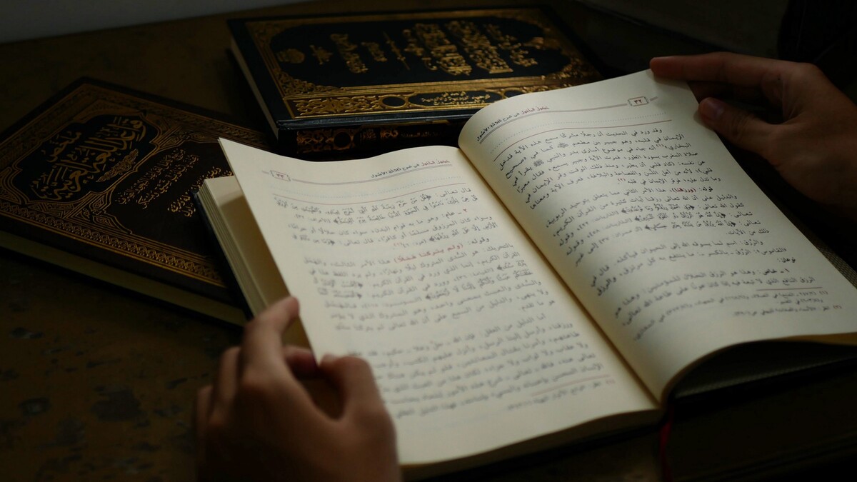
Not exactly. In English, we start reading and writing from left to right. The second we pick up a pen or scan the screen, our instinct is to follow that west-east orientation. It makes sense. We’re used to it. But the fact is several billion of us do things quite differently. Just like our taste in books varies, so too does our linguistic background. Many of us learn to read, write, and yes, even type, from Right to Left. Arabic, Hebrew, Farsi, and Urdu are just some of the languages that rely on right-to-left script (RTL). Moreover, with traditional Chinese and Japanese script, not only is right-to-left used but also top-to-bottom. So what exactly constitutes RTL script? How does it differ from left-to-right (LTR) and English or other European languages? What makes it unique? We asked Maryam (Farsi, using Arabic script with minor modifications), Yusuf (Arabic) and Hila (Hebrew) to share their personal experiences and insights on RTL script.
Right to Left and Back Again: RTL Script in Farsi, Arabic, and Hebrew.
Jens: Hi Maryam, Yusuf, and Hila!
Maryam: Salam! سلام
Yusuf: Asalamu Alaykum! السلام عليكم
Hila: Shalom! שלום
Jens: Neat! I’m looking forward to learning about RTL with you. Can you start us off with a quick background, Maryam?
Maryam: Of course! When you think about it, the world of RTL is a lot like your local bookshop. It’s got a long and rich history, it’s stacked with different genres, and it boasts its own celebrity authors…
Yusuf: Exactly. We can trace RTL very early on in history, predating for example Arabic script. The Ancient Egyptians carved their temples with hieroglyphs using both LTR and RTL scripts. In their scribal documents, however, they relied on a simplified form of hieroglyphs (hieratic and later demotic script) and wrote their texts from right to left. For example, the tale of the fugitive ‘Sinuhe’ — one of the earliest political thrillers ever written — is famously recorded from right to left on the Papyrus Berlin 10499, held at the British Museum. You can see it in all its weathered glory here.
Jens: That sounds interesting, Yusuf. Maryam, Hila, do you know any other examples?
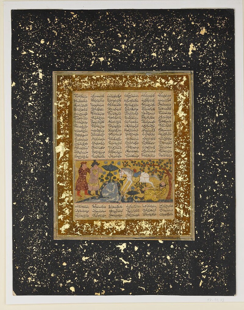
Maryam: Yes, I can think of some traditional calligraphy from Persia in the 14th century AD; The Book of Kings, or Shahnameh. It’s a masterpiece by the poet Ferdowsi every bit as twisty as a modern adventure — think love, war, and revenge. There’s a beautiful copy on display at the Met Museum; check out its 14th century adaptation here.
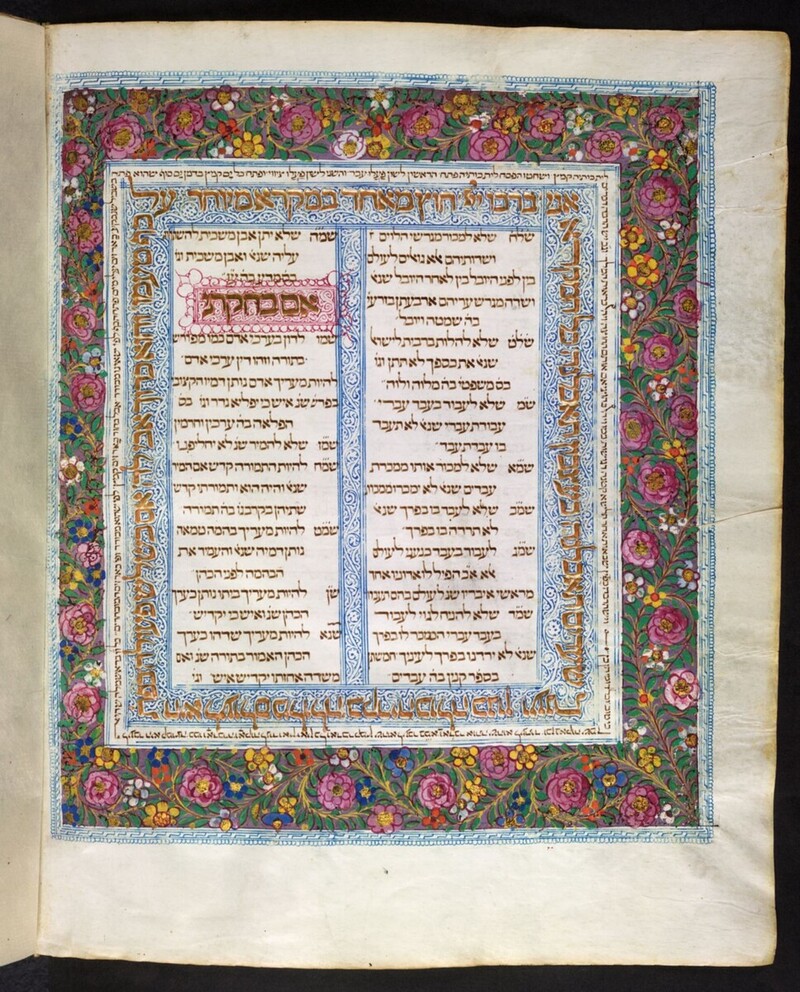
Hila: That looks wonderful, Maryam, and it reminds me of a Hebrew manuscript in the British Library; The Lisbon Bible by the scribe Samuel ben Samuel Ibn Musa. It dates to the late fifteenth century AD and originates from Portugal. It includes all the volumes of the Tanakh (Hebrew Scriptures): the Torah (Instructions), the Nevi’im (Prophets), and the Ketuvim (Writings). Take a look at its gorgeous calligraphic patterns here!
Jens: They do look wonderful, Hila! But RTL isn’t just about old papyri or glittering manuscripts, is it?
Yusuf: You’re right. It extends well into our own era of printing, publishing, and sharing. Ask any Beirut local what their favorite brand of bookshop is, and they’d most likely reply with Librarie Antoine. They stock typical LTR texts in English and French, but they also have a wealth of Arabic-printed and digital RTL content; from Khalil Gibran’s iconic poetry books to Arabic translations of the popular children’s series Miraculous Ladybug (yes, really). See for yourself!
Jens: That’s interesting! So how does RTL script differ from LTR and English? What makes it different?
Maryam: Well, to start off, in Farsi we call traditional calligraphy ‘Nastaliq’. As you can see in the Ferdowsi example, this script is very beautiful but also quite complex. When you look at the letters closely, you can see how some are joined together, while other letters change form depending on where they are placed (at the end or beginning of a word). This is normal in Farsi script, whereas in English you’d probably only come across it in cursive handwriting.
Let’s use another example; note the ‘s’ at start of the name ‘Sarah’: راسا
Looks simple enough, right?
Not quite. At the end of the Farsi word for ‘guess’, the ‘s’ then changes to something like this: سحد
So not only do you have to look out for joined letter forms, but also different word endings and their letter forms as well. It’s a bit more complex than in English…
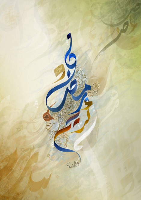
Yusuf: Yes! In Arabic script it’s almost the same. But on top of that, with Arabic you also have to note the ‘harakat’, or diacritics as they’re known in English. These are tiny marks on the top or bottom of letters that provide the correct pronunciation of the word or phrase. If you look at this example of calligraphic writing, a “Ramadan Mubarak” (Happy Ramadan) greeting, you can see how the harakat have been cleverly incorporated into the design.
Hila: Ah, we have something similar in Hebrew; we call them ‘nikud’. They look like little dots, dashes and ‘T’-shaped marks. But we don’t use them much outside of formal texts. For example, here is the word for ‘year’, shana, with nikud: שָׁנָה Here’s the same word without nikud: שנה
Yusuf: We use almost the same word for year in Arabic, Hila! Sana: سنة
Hila: That’s interesting, Yusuf! On that note, I actually have trouble telling Arabic from Farsi script apart. Any tips, Maryam?
Maryam: Good question! I can think of a few ways. First, the extra letters. Farsi also contains چ, پ, ژ, and گ.
Jens: Okay, so if we had to quickly check if a text is in Farsi or Arabic, we’d need to keep an eye out for these letters …
Maryam: That’s correct. And to make things a little more complicated, unlike Arabic and traditional European scripts whose writing follows a horizontal baseline, in Nastaliq we sometimes write on a sloped baseline or we set words within a line on more than one parallel baselines!
But, when it comes to normal text we use paragraphs just like in English, and the paragraphs are often indented with line spacing quite similar to what you know from English print.
Yusuf: Yes, we can find some indented paragraphs in Arabic, too. But in my experience, Arabic writing tends to look more fluid than English. Less structured, if you like.
Jens: That’s quite an intriguing challenge for book design, in print and digital publications…
Yusuf: It is, yes, but on the other hand, we’re seeing some interesting developments. For example, type design technology is making its way into Middle-Eastern typography and calligraphy, especially to create equivalents of serif or sans serif fonts (which aren’t really typical in Arabic script).
Hila: Yeah, this technology would be great for Hebrew as well. There’s a big difference between traditional serif script and the more modern looking sans serif. For example, whereas serif script would be more commonly found in religious and formal texts, I’m seeing a lot of sans serif on the internet generally and on popular media, like this bold title design for pop singer Kobi Peretz.
Yusuf: Good point! I think with the increased demand for Arabic script online, we keep getting fresher and simpler styles, like this lyric video script for singer Amr Diab.
Hila: I’ll have to give that a listen, Yusuf!
Yusuf: It’s pretty good! But on the topic of RTL, we’re also seeing more font pairings for bi-lingual books.
Hila: Ah, so for books that contain both English and Hebrew script, for example …
Maryam: That would come in handy for cook books!
Yusuf: Agreed! Like this vegan recipe book, for example, which has the instructions and ingredients in both English and Arabic on the same page.
Jens: That sounds delicious, Yusuf. Seeing both scripts together, though, I did notice something…
Maryam: I think I can guess what that is. The numbers still look as if they’re written in English. They also face left-to-right, even though they are placed right-to-left in the order of the sentence.
Jens: Talk about confusing!
Yusuf: Yes, actually the numbers we use in English were originally applied in Arabic script — hence ‘Arabic numerals.’ So, to English readers, they look as if they’re left-to-right. More commonly though, we use the Eastern Arabic system, or ‘Indic numerals’, which looks like this: ١ for 1, ٢ (2) ٣ (3) ٤ (4) ٥ (5) ٦ (6) ٧ (7) ٨ (8) ٩ (9) …
Maryam: Yusuf, this looks a lot like Persian numerals, except we have ۴ for four, ۵ for five and ۶ for six.
Yusuf: Do you use ٠ for zero, Maryam?
Maryam: Yes, we do!
Jens: Ah, that makes me wonder… What about formulas in math and other sciences?
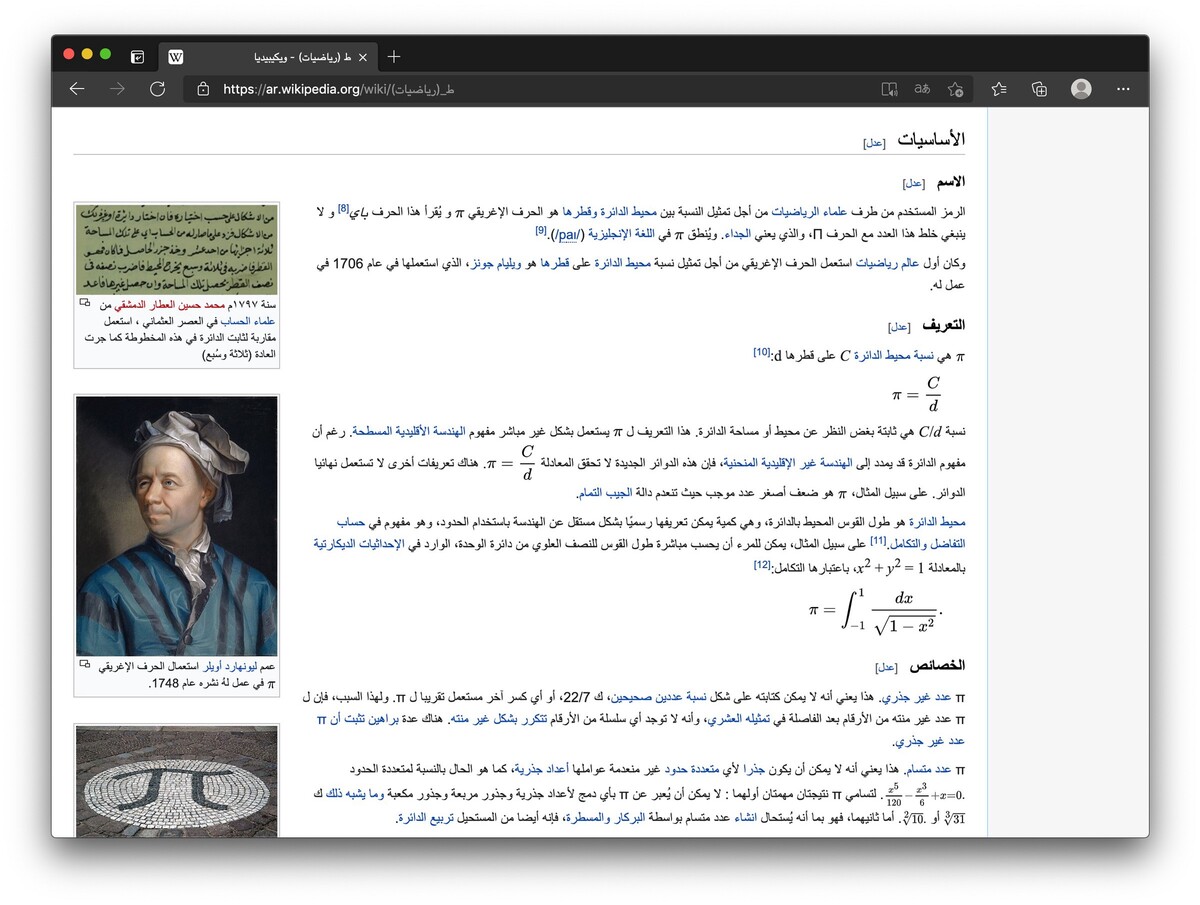
Yusuf: Good question! These can be written in both right to left and left to right directions. Take a look at this Wikipedia page of the number Pi in Arabic:
Maryam: The direction of axes in scientific graphs follows LTR, too.
Jens: Wow, must have been tough learning maths at school!
Yusuf: Ha, tell me about it! But at least music was easier. The notes follow the same form as in English.
Jens: That’s really interesting info, thank you Maryam, Hila and Yusuf! From what you’ve told us, RTL script comes with its own host of unique characteristics and challenges, whether you’re working with Arabic, Farsi, Hebrew or other languages. Let’s step back and see how Bookalope manages those challenges when we’re creating books. Bye for now!
Yusuf: Ma’asalama! مع السلامة
Hila: Shalom! שלום
Maryam: Khouda Hafiz! خداحافظ
Bookalope’s Support for RTL Script
Clearly — with reading audiences expanding and the demand for more translated, multi-lingual and native content increasing — the need for LTR and RTL script support across a variety of book genres and publication mediums is more pronounced than ever.
Bookalope helps you build books that can contain either one or both script directions. You simply upload your book’s manuscript in its original format, and Bookalope will guide you through the process. Script direction is identified automatically, and you don’t need to worry about any of the layout and styling challenges that come with different script directions.
The key is, as described in our online user manual, to tell Bookalope which languages you’re using in your book: the primary language of the main narrative and any additional secondary languages that Bookalope needs to be aware of. From those language settings Bookalope determines the script direction of the whole book, the ebook’s metadata, and it identifies and marks up text portions in any of the secondary languages, all automatically.
A word of caution, though. Building an accessible ebook is no guarantee that the reading app or device will be able to display an ebook correctly! For example, Kindle devices have trouble rendering RTL text properly, and some devices like the Nook struggle to display some letter glyphs. The good news is, though, that apps like Thorium and Apple Books have no problems rendering different script direction and language specific letters in mixed-language ebooks.
The market is rapidly advancing to accommodate ebooks and other electronic publications in any language. When in doubt, focus on building proper accessible ebooks in any language, and hopefully the weight of good quality ebooks will advance reading applications, too.
Creating beautiful and accessible books is not difficult, and we hope that Bookalope helps you realize your books so that your readers can enjoy your books fully—no matter their languages!